Album Cover Construction
 This is the raw photograph that we have taken for the front cover of our album, we knew that we wanted to cut around the outline of our model - using the magnetic tool - and put her on a completely different background so we didnt worry too much about the surrounding area of the photo. We chose this outfit for our model because we thought that the simple black and white colours would not distract attention from the main feature of the photograph which is the lightbulb head.
 After cutting out our model and placing her on a different background (a temporary background which allowed us to focus on getting the image of the person just right) we added an effect which made the photograph look as though it was painted, we rubbed out her head and replaced it with a picture of a lightbulb which we also added the effect to. We hope that this effect makes the image look as though it was painted which would add more of an artistic element to it, and seeing as a lot of album covers feature artwork we hope that it makes it look authentic. We replaced our models head with a lightbulb to compliment the title of the album which is 'torches,' we plan to carry on this theme throughout our other three panels and feature different photographs of different sources of light

We experimented with a variety of different effects to see which would look best on our picture, and when we settled on the 'paint daubs' effect we tried our different strengths to see which would look the most effective. We didnt like the strenght that is shown here because we think it takes the 'look like its painted' element away and you lose a lot of the details of the photo so we lowered the strentgth.
We changed the background to a simple beige colour and then added a border so that when we moved the overall image onto the black background, there would be a barrier between the two squares. We first tried the border in white but when we put the whole image onto the black background you couldnt really see it very well so we changed the colour of it to burgandy.
Once we changed the colour of the border, we linked all of the layers together and moved the image onto a black background and centered it, we then added the writing onto our cover, the name of the band at the top and the title of the album at the bottom. Luckily, when we went onto the website 'dafont.com' looking for a font and we found a font called pumped up kicks, so obviously we used it because it is exactly what we need to make our cover look authentic.
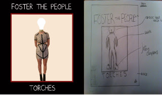
If we compare the final front cover of our album to the flat plan that we produced, you can see that we have stayed true to our plan and they look exactly alike. The flat plan has helped us figure out what we were going to do which made actually putting the cover together easier and quicker than it would have been without the flat plan.
Inside Left Cover...
This is the raw photo that we have used for our inside left cover, using the magnetic tool I cut around the hand so that I could transfer it onto a black background, the aim of this picture is to follow the theme of humans as sources of light, not literally but metaphorically, we want to add artificial light to different body parts so that if compliments the name of the album.
Once I transferred the image of the hand onto the black background, I added an effect that would make the image look like it was drawn, the effect was called 'rough pastels,' I made the strength of this effect quite high so that it can be seen easily that it is supposed to look drawn, I centered the image in the frame so that it is the main attraction of the picture.
Next I used the magnetic tool again to cut round the flame of this photograph that I took, once I had done that I added the same effect that I had put on the picture of the hand so that the flame would look as though it was drawn aswell, I then transferred the image onto the file with the hand and positioned it on top of the index finger so that it would look like there was a flame coming out of the hand.
Once we had added the flame onto the finger all we had to do was position it and add a drop shadow so that it looked like it was actually coming out of the finger. I added a film grain effect to the background of the picture because the flat black made the whole image look like it had been edited where as the slight effect to the background makes it look more authentic and like it could exist in the real media world.
Back Cover...
To create the back cover for our album I simply got a black background on Photoshop and used the text tool to add the track list onto the background. I chose to do the writing in white so that it would compliment the background and because the writing on the other panels of the album is also white so this reinforces the house style of it. I also used an image of a barcode and put it in the bottom left hand corner to make it look authentic. As well as this, i used the text tool again to write the Foster the People website and put it at the bottom of the case, this is conventional of album covers; the majority of them feature this. The font that we used was the 'Pumped Up Kicks' font, we used this because it is the same font that we have featured on the cover of the album.

I used this logo of 'Star Time Entertainment' and put it next to the barcode at the bottom of the cover. This makes the overall image look like it could exist in the real media world because it has the logo of the publisher. Without having a logo on the cover it would take away the professional element that we have aimed to achieve when creating our digipak.

 Creating the spine of the cover was actually quite easy, all we needed was a black column that we could add the band name and the album name to as well as the catalogue number.
 This is the raw photograph that we have taken for the front cover of our album, we knew that we wanted to cut around the outline of our model - using the magnetic tool - and put her on a completely different background so we didnt worry too much about the surrounding area of the photo. We chose this outfit for our model because we thought that the simple black and white colours would not distract attention from the main feature of the photograph which is the lightbulb head.


No comments:
Post a Comment