Tuesday, 16 April 2013
Sunday, 24 March 2013

Thursday, 14 March 2013
Monday, 4 March 2013
Evaluation Question 4
4. How did you use media technologies in the construction and research, planning and evaluation stages?
Simply put, without media technology, we would not have been able to create a music video that would look as though it could exist in the real media world. The technologies that were available to us and that we were able to use allowed us to create an effective piece of media coursework, but also to present it in an attractive and interesting way.
 Firstly, in the research and planning stages, a technology that was hugely helpful was youtube. Youtube allowed us to view copious amounts of music videos, both recent and as far back as Bohemian Rhapsody, we could then analyse these videos closely and watch them as many times as we needed in order to get a full understanding of what existed in a music video that existed in the real media world. As well as this, we could take screen grabs to put on our blogs which we could use to illustrate what we were saying in our research posts, the addition of visual aids made our essays more interesting to read and meant that the reader could understand more fully what we were trying to say.
Also, we used Youtube to upload our video onto which we could then embed into a post on our blog, this was helpful because it was quick and easy to upload videos to Youtube and we could set our videos to 'unlisted' which meant that we felt satisfied that they wouldnt be found by the general public and no unwanted comments would be left.
 Secondly, also in the research and planning stages, the use of prezi was very helpful in presenting our work. Prezi allowed me to efficiently present my work in an organised way using a combination of writing and pictures. As opposed to putting the writing and pictures straight onto my blog, I could create a 3D prezi presentation that moved and once I had finished, I could then embed the presentation onto my blog as opposed to merely posting a link which would have looked unorganised and unfinished.
For the research and planning for our ancillary task, the use of websites such as NME.com and Q.com to see different album covers and to see how they were advertised on these websites, from this we could then plan what we were going to feature on our digipak and magazine advert. Similarly to this, when doing reseach for our music video, I watched channels such as MTV Rocks and Kerrang! in order to see how music videos looked on a television in comparison to how they looked on Youtube, watching the music channels was in some ways better than searching om videos on Youtube because it meant that you would see videos that you wouldnt have perhaps searched for online, where as when youre using Youtube, its a very narrow search and you have to know exactly what music video you want to watch which limits your analysis.
In planning especially, websites such as Glogster.com were helpful in displaying the stages of our plan efficiently, it allowed us to use arrows and pictures to show what steps we were going to take and when we were going to take them. Similarly to this, my iPhone was really helpful in trying to keep us organised, the calendar and the reminder alerts meant that I would be reminded when I had to do something and write on the days of the calendar when we were going to be filming and what time we would be, this meant that we had a schedule to stick to which meant that we could get the filming done efficiently and without any unexpected hiccups interrupting the process.
In the construction stages of our music video, the most important pieces of technology we used was the Nikon camera (to film our video, take pictures of equipment and pictures for our ancillary task) and an Apple Mac (which offered us final cut, photoshop, access to the internet and tools such as the screengrab tool.)
The Nikon camera that we used was essential in the construction of our music video, the camera allowed us to zoom, manually focus and take photos as well as videos. This meant that our video came out looking professionally done due to the quality of the video that the camera produced - this we perhaps wouldnt have gained if we had used a slightly less sophisticated camera.
 The apple mac that we used was crucial in the effective construction of our music video. Without access to this technology, we wouldnt have been able to create our music video and ancillary task as effectively as we did in the time that we were given. Going through our footage and essentially putting it all together would have been time consuming and difficult without the programmes the the mac offered. As well as this, the mac allowed us access to the internet which was crucial in allowing us to display our coursework as well as in the research and planning stages.
 One of the programmes that the apple mac offered us, was final cut. This programme allowed us to import our footage, drag it into the viewer window, choose the part of the footage that we wanted and then drag the piece that we wanted into the timeline. This allowed us to ensure that the miming was effective and also gave the audience different camera angles because we could put footage from different camera angles next to eachother. Once we had dragged all of our footage into our timeline, and rendered it all (which was very time consuming) we were then able to export our final video into a format that could be uploaded to Youtube then onto our blog.
Below is a link of some of the ways in which we used Final Cut...

 Another programme that the mac offered us was photoshop, we used this programme profusely in our AS media when we had to produce a magazine cover so using it to create our ancillary task was easy because we already knew how to use the tools and we didnt have to learn how to use the programme all over again. Photoshop allowed us to turn a raw image into what looked like artwork with the effects that it offered, we chose to use the 'paint daubs' effect in order to make our ancillary task look as though it had been painted rather that digitally edited. Also using tools like the crop tool, the paint bucket tool and the grab tool meant that we could quickly create images that we needed to put on our blog, for example the collage of images that is used to show our target audience.
The mac also offered us other useful applications such as the screengrab tool which allowed us to easily get images for our blog and we could easily capture the stages of our construction.
For the evaluation stage of producing my coursework, Final Cut again was really helpful in allowing me to produce videos for my evaluation questions. As well as this, I used my iPhone to record my voice clips which I could then transfer to the mac and import into final cut, I could then add images and video clips which illustrated what I was saying in the video. My iPhone was also helpful in videoing people that wanted to give us feedback on our music video for evaluation question 3, this again could be imported into final cut and helped us answer question 3 more effectively. The final technology that has been extremely useful in all four stages was Blogger, Blogger has allowed us to present our coursework in an organised fashion and we could decide where we wanted the writing and pictures, as well as this, we could embed videos which made the overall presentation more interactive and interesting.
Simply put, without media technology, we would not have been able to create a music video that would look as though it could exist in the real media world. The technologies that were available to us and that we were able to use allowed us to create an effective piece of media coursework, but also to present it in an attractive and interesting way.
Also, we used Youtube to upload our video onto which we could then embed into a post on our blog, this was helpful because it was quick and easy to upload videos to Youtube and we could set our videos to 'unlisted' which meant that we felt satisfied that they wouldnt be found by the general public and no unwanted comments would be left.

For the research and planning for our ancillary task, the use of websites such as NME.com and Q.com to see different album covers and to see how they were advertised on these websites, from this we could then plan what we were going to feature on our digipak and magazine advert. Similarly to this, when doing reseach for our music video, I watched channels such as MTV Rocks and Kerrang! in order to see how music videos looked on a television in comparison to how they looked on Youtube, watching the music channels was in some ways better than searching om videos on Youtube because it meant that you would see videos that you wouldnt have perhaps searched for online, where as when youre using Youtube, its a very narrow search and you have to know exactly what music video you want to watch which limits your analysis.
In planning especially, websites such as Glogster.com were helpful in displaying the stages of our plan efficiently, it allowed us to use arrows and pictures to show what steps we were going to take and when we were going to take them. Similarly to this, my iPhone was really helpful in trying to keep us organised, the calendar and the reminder alerts meant that I would be reminded when I had to do something and write on the days of the calendar when we were going to be filming and what time we would be, this meant that we had a schedule to stick to which meant that we could get the filming done efficiently and without any unexpected hiccups interrupting the process.
In the construction stages of our music video, the most important pieces of technology we used was the Nikon camera (to film our video, take pictures of equipment and pictures for our ancillary task) and an Apple Mac (which offered us final cut, photoshop, access to the internet and tools such as the screengrab tool.)
The Nikon camera that we used was essential in the construction of our music video, the camera allowed us to zoom, manually focus and take photos as well as videos. This meant that our video came out looking professionally done due to the quality of the video that the camera produced - this we perhaps wouldnt have gained if we had used a slightly less sophisticated camera.

Below is a link of some of the ways in which we used Final Cut...
The mac also offered us other useful applications such as the screengrab tool which allowed us to easily get images for our blog and we could easily capture the stages of our construction.
For the evaluation stage of producing my coursework, Final Cut again was really helpful in allowing me to produce videos for my evaluation questions. As well as this, I used my iPhone to record my voice clips which I could then transfer to the mac and import into final cut, I could then add images and video clips which illustrated what I was saying in the video. My iPhone was also helpful in videoing people that wanted to give us feedback on our music video for evaluation question 3, this again could be imported into final cut and helped us answer question 3 more effectively. The final technology that has been extremely useful in all four stages was Blogger, Blogger has allowed us to present our coursework in an organised fashion and we could decide where we wanted the writing and pictures, as well as this, we could embed videos which made the overall presentation more interactive and interesting.
Evaluation Question 3
3. What have you learned from your audience feedback?

Gaining feedback for all of the different aspects of our work allowed us to improve our grade and make our work more appealing for our target audience. It allowed us to see mistakes that we may have previously overlooked and see other perspectives of our work. Some of the feedback we disagreed with but seeing other perspectives was good for deciding what to change. Some feedback that we gained from different people said completely opposite things, for example, some people said that the bit of narrative that is in our rough cut should have been kept because it breaks up the video, however, others said that the whole thing should be performance. Because of this, we asked people which they preferred and then proceeded to do whatever the majority said.
Survey created by Faye Rodgers
Tuesday, 26 February 2013
Monday, 25 February 2013
Final Cut Construction


 Once we got about half way through making our video, we decided to put in the ending before finishing it, this is because we could then see how our video was going to end so we could build a climax at the end of our video leading up to the finale so we planned what shots we were going to use accordingly.
Once we had done the verses and put in the ending we filled in the chorus', we wanted to feature the majority of our close ups in the chorus' because we feel like that is when our song was the most exciting so we wanted to use the close ups to emphasise this so we used close ups if the lead singer, guitar being played and the drums being played, when editing we made sure that the instruments fitted in well with the song and looked like they were actually being played so that our music video would look more authentic.
 Once we had finally finished our music video we converted it using quick time conversion, we did this so that our music video would be in a format that could be uploaded to Youtube and then put on our blog as opposed to just posting a link, converting our music video took a really long time, about an hour, so when it was done we were anxious to just put it on Youtube and get it posted onto our blog.
 The next, and final step was to upload our video to Youtube, this as well took a really long time and we had a few moments when we thought that it just wasn't going to work and we would have to find another way to put it on our blog, however, thankfully it eventually uploaded and we were able to get the embed code and post it on our blog.
Friday, 15 February 2013
Font Options

Wednesday, 13 February 2013
Final Ancillary Task

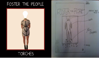
These are the final four panels for our album cover, we wanted the house style to be sources of light because the album is called 'Torches'


Poster by Faye Rodgers
Tuesday, 12 February 2013
Evaluation question 1
1. In what ways does your media product use, develop or challenge forms and conventions of real media products?
For our media coursework my group decided to create a music video and a digipak and magazine advert. We chose this because we felt as though it was the option that we could achieve the most in, creating a game or a teaser trailer didnt really appeal to us because we are interested in music and the way that music is presented in the media. Before starting our coursework, we researched a lot of music videos like Eminem's 'Stan' and Geri Halliwells 'Its Raining Men'. This research allowed us to analyse and find the conventions that exist in music videos. As well as this, we looked at Andrew Goodwins novel 'Dancing in the Distraction Factory', looking at this novel allowed us to identify and make a list of all of the conventions of music videos. After looking at video's by Eminem and Geri Halliwell and identifying the conventions, we moved on to looking at videos that existed in the genre that our song choice was from, I looked at a video by the Foo Fighters and also Queen and Arctic Monkeys, doing this allowed us to take the list of conventions, and see how they were developed in the videos from our genre.
 A convention that we thought it was especially important to maintain was the use of close up shots in our music video, we used a lot of close ups of our lead singer; it is conventional for the lead singer/front man of the band to be flattered by the camera, we also featured some close ups of our guitar player because he sings in the chorus but for the drummer and the guitarist we mainly tried to feature close ups of their instruments instead because that focuses on their specific talent, much like getting a close up of the lead singer focuses on the talent that he brings to the band.
close up of tom from Paige French on Vimeo.
 If I
look back at my planning, I see the shots from other music videos
that we wanted to take inspiration from, for example we wanted a
similar shot to this close up from the killers music video 'are we
human' and we achieved this, as well as this, we wanted a close up of
the guitar like this shot from an Arctic monkeys video which we also
achieved, the fact that we have shots in our video that are similar
to those in videos that exist in the real media world gives us
confidence in the success of our music video.
If I
look back at my planning, I see the shots from other music videos
that we wanted to take inspiration from, for example we wanted a
similar shot to this close up from the killers music video 'are we
human' and we achieved this, as well as this, we wanted a close up of
the guitar like this shot from an Arctic monkeys video which we also
achieved, the fact that we have shots in our video that are similar
to those in videos that exist in the real media world gives us
confidence in the success of our music video.
 A convention that we challenged was the use of performance and narrative, a lot of music videos often have a mix of performance and narrative to break up the video and make it more interesting, however we challenged this convention and made the whole of our video performance based because we wanted to give our target audience an idea of what it would be like to go and see the band perform live. However, in our rough cut we followed the convention by adding a bit of narrative in the middle of the video, although a lot of people that we showed our rough cut to actually like the element of the narrative because "it broke the video up" we decided not to put it into our final cut because we think that it made the video not really make sense and didnt look like a gig.
 We wanted the lead singer of our music video to be active and as though he was actually enjoying being a part of the band, we looked at some shots of Serge in the Switchblade Smiles video and compared them to some of the shots that we have of Tom in our video and it shows that we have created shots that could exist in the real media world.

 We used medium long shots in our music video when we wanted the whole band to be seen, we did this usually in the verses because you could then see each band member in their element, you could see that the singer was singing and the drummer and guitarist were playing their instruments and we think that this made the video look authentic because it actually looked like they were performing. Medium shots are used a lot in narrative based videos because there is often a story and the whole frame needs to be seen to allow the audience to see everything, we used it so that the whole band could be seen working together.
 Our
ancillary task develops the forms and conventions of album covers by
using artwork as opposed to a picture of the band, this is often the
case with bands' albums which is why we did it. The theme of the
images that are featured on our album cover is 'humans as sources of
light' we showed this by replacing human body parts with sources of
light like a bulb or a flame, this idea was inspired by the Two door
cinema club cover for the album beacon. The theme of our ancillary
task is also closely linked with the name of the album, torches.
Our
ancillary task develops the forms and conventions of album covers by
using artwork as opposed to a picture of the band, this is often the
case with bands' albums which is why we did it. The theme of the
images that are featured on our album cover is 'humans as sources of
light' we showed this by replacing human body parts with sources of
light like a bulb or a flame, this idea was inspired by the Two door
cinema club cover for the album beacon. The theme of our ancillary
task is also closely linked with the name of the album, torches.
 Our back
cover also uses conventions by having a barcode and the website of
the band which is featured on most albums. We maintained a house style throughout our ancillary tasks; we used the same font, kept the font as the same colour, had the same background colour and kept and ongoing theme in all of the images that we used for the cover and the poster. Our album cover is conventional of indie bands' cover because of the simple colours that are used as well as the clothing that our model wears. Here you can see the similarities that exist between our back cover, and a cover that exists in the real media world - the track list for an album by The XX.
Our back
cover also uses conventions by having a barcode and the website of
the band which is featured on most albums. We maintained a house style throughout our ancillary tasks; we used the same font, kept the font as the same colour, had the same background colour and kept and ongoing theme in all of the images that we used for the cover and the poster. Our album cover is conventional of indie bands' cover because of the simple colours that are used as well as the clothing that our model wears. Here you can see the similarities that exist between our back cover, and a cover that exists in the real media world - the track list for an album by The XX.
 When creating our magazine advert, there are several conventions that we wanted to follow, we had to ensure that we had the bands website on the advert, we wanted to have ratings from music publications, have the central focus of the advert be the picture - so that the audience would be able to recognise the cover of the album if they decided to buy it - and to have links to the bands Facebook and Twitter. We feel as though we followed these conventions well and that our magazine advert would look authentic when displayed in a real magazine publication. Similarly to all of these adverts displayed, we have featured the artists name and the name of the album on our poster and we have shown when it is released, we have also featured the bands website which is featured on all of these real adverts.
For our media coursework my group decided to create a music video and a digipak and magazine advert. We chose this because we felt as though it was the option that we could achieve the most in, creating a game or a teaser trailer didnt really appeal to us because we are interested in music and the way that music is presented in the media. Before starting our coursework, we researched a lot of music videos like Eminem's 'Stan' and Geri Halliwells 'Its Raining Men'. This research allowed us to analyse and find the conventions that exist in music videos. As well as this, we looked at Andrew Goodwins novel 'Dancing in the Distraction Factory', looking at this novel allowed us to identify and make a list of all of the conventions of music videos. After looking at video's by Eminem and Geri Halliwell and identifying the conventions, we moved on to looking at videos that existed in the genre that our song choice was from, I looked at a video by the Foo Fighters and also Queen and Arctic Monkeys, doing this allowed us to take the list of conventions, and see how they were developed in the videos from our genre.
A convention that we thought it was especially important to maintain was the use of close up shots in our music video, we used a lot of close ups of our lead singer; it is conventional for the lead singer/front man of the band to be flattered by the camera, we also featured some close ups of our guitar player because he sings in the chorus but for the drummer and the guitarist we mainly tried to feature close ups of their instruments instead because that focuses on their specific talent, much like getting a close up of the lead singer focuses on the talent that he brings to the band.
The close ups of the lead singer that we used were mainly featured during the chorus', this highlights the importance of the chorus because it brings the story of the lyrics together. It is also the chorus of most music videos that a lot of the close ups are featured because its when the song reaches its climax usually. There is a lot of demand from record companies for a lot of close ups of the lead singer so we tried to follow this. The use of this kind of close ups is used a lot in the music videos that we looked at in our previous research, Dave Grohl is flattered by the camera in the Foo Fighters music video that I looked at but most importantly, the close ups that I saw of Alex Turner in the Arctic Monkeys videos is what gave me the inspiration for the close ups of Tom in our music video.
close up of tom from Paige French on Vimeo.
If I
look back at my planning, I see the shots from other music videos
that we wanted to take inspiration from, for example we wanted a
similar shot to this close up from the killers music video 'are we
human' and we achieved this, as well as this, we wanted a close up of
the guitar like this shot from an Arctic monkeys video which we also
achieved, the fact that we have shots in our video that are similar
to those in videos that exist in the real media world gives us
confidence in the success of our music video. A convention that we challenged was the use of performance and narrative, a lot of music videos often have a mix of performance and narrative to break up the video and make it more interesting, however we challenged this convention and made the whole of our video performance based because we wanted to give our target audience an idea of what it would be like to go and see the band perform live. However, in our rough cut we followed the convention by adding a bit of narrative in the middle of the video, although a lot of people that we showed our rough cut to actually like the element of the narrative because "it broke the video up" we decided not to put it into our final cut because we think that it made the video not really make sense and didnt look like a gig.
However, we got the idea to make the whole video performance based from watching the video for 'Switchblade Smiles' By Kasabian...
This video is all performance based which means that our music video would still be successful in the real media world, this video has had major success with over 2 million views on youtube and there is nothing to break up the performance and the narrative so we decided not to either.
 We wanted the lead singer of our music video to be active and as though he was actually enjoying being a part of the band, we looked at some shots of Serge in the Switchblade Smiles video and compared them to some of the shots that we have of Tom in our video and it shows that we have created shots that could exist in the real media world.
Another
convention of music video's, is that the tempo of the track is used
to drive the editing, our music video does this by changing shot when
a drum beat is heard or a guitar strum, this contributes towards the
effectiveness of the continuity editing. This is also applied to when the track slows down, when it slowed down we put the footage into slow motion to emphasise this.

looking
back at my research of the conventions of music videos I see that
there is often a relationship between the music and the visuals in a
music video. Our video develops this convention firstly by using
shots that illustrate this relationship, for example, when a guitar
strum is heard, our video cuts to a shot of a guitar, and similarly
to this, when a drum beat can distinctly be heard, it cuts to a close
up of the drums. This is done in all music videos so that the transition between shots is smooth and flatters the music, for example, in the Kasabian video for 'Fire'
 We used medium long shots in our music video when we wanted the whole band to be seen, we did this usually in the verses because you could then see each band member in their element, you could see that the singer was singing and the drummer and guitarist were playing their instruments and we think that this made the video look authentic because it actually looked like they were performing. Medium shots are used a lot in narrative based videos because there is often a story and the whole frame needs to be seen to allow the audience to see everything, we used it so that the whole band could be seen working together.
Before starting our ancillary task we looked at other album covers from bands in our genre, I looked at the covers of CD's that I had at home like Bombay Bicycle Club and Vampire Weekend because they have a similar sound to Foster the People, I also looked at covers from Two Door Cinema Club and Arctic Monkeys online to see what the artwork was like and how it linked with the name of the album, from this we could plan our artwork accordingly to make sure that it looked authentic and appealed to our target audience.
When creating our magazine advert, there are several conventions that we wanted to follow, we had to ensure that we had the bands website on the advert, we wanted to have ratings from music publications, have the central focus of the advert be the picture - so that the audience would be able to recognise the cover of the album if they decided to buy it - and to have links to the bands Facebook and Twitter. We feel as though we followed these conventions well and that our magazine advert would look authentic when displayed in a real magazine publication. Similarly to all of these adverts displayed, we have featured the artists name and the name of the album on our poster and we have shown when it is released, we have also featured the bands website which is featured on all of these real adverts.Monday, 11 February 2013
Meet Our Actors
Tom Mcmahon
Tom is our Lead singer, front man and keyboard player...you may notice him from our rough cut, he was the drummer!

Matt Dickinson
Matt is our new drummer...

Tom Hammond
Finally, Tom (#2) is our guitar player and only member of the band from our rough cut that has the same role!

Sunday, 10 February 2013
Album Cover Construction
 This is the raw photograph that we have taken for the front cover of our album, we knew that we wanted to cut around the outline of our model - using the magnetic tool - and put her on a completely different background so we didnt worry too much about the surrounding area of the photo. We chose this outfit for our model because we thought that the simple black and white colours would not distract attention from the main feature of the photograph which is the lightbulb head.
 After cutting out our model and placing her on a different background (a temporary background which allowed us to focus on getting the image of the person just right) we added an effect which made the photograph look as though it was painted, we rubbed out her head and replaced it with a picture of a lightbulb which we also added the effect to. We hope that this effect makes the image look as though it was painted which would add more of an artistic element to it, and seeing as a lot of album covers feature artwork we hope that it makes it look authentic. We replaced our models head with a lightbulb to compliment the title of the album which is 'torches,' we plan to carry on this theme throughout our other three panels and feature different photographs of different sources of light


Inside Left Cover...


Once I transferred the image of the hand onto the black background, I added an effect that would make the image look like it was drawn, the effect was called 'rough pastels,' I made the strength of this effect quite high so that it can be seen easily that it is supposed to look drawn, I centered the image in the frame so that it is the main attraction of the picture.


Once we had added the flame onto the finger all we had to do was position it and add a drop shadow so that it looked like it was actually coming out of the finger. I added a film grain effect to the background of the picture because the flat black made the whole image look like it had been edited where as the slight effect to the background makes it look more authentic and like it could exist in the real media world.
Back Cover...


Final Cut Feedback
 On Friday, we showed our video to our media class in order to gain some feedback which would evidently help us to improve our Final Cut even further. Showing it to our media class meant that we got the perspective of a media student so they would be able to notice more mistakes such as errors in continuity editing, as well as this, we are going to show the video to non-media students and see how the feedback differs
  A lot of the feedback that we got generally said that we need to focus on our continuity editing, and make some of the shots a bit shorter because there wasn't a huge variety of angles and camera shots, we plan to change the editing and put some more shots in to make it look more authentic as well as making sure that is editing is continuous and the transition between shots is smooth.
Subscribe to:
Comments (Atom)