I looked at album covers from the same genre that our song is from and found a range of different ideas in the artwork. Some artists take the 'simple and effective' route - such as the album cover for The XX's album, xx - where as some artists, like Florence Welch, make the album cover look more like a piece of artwork.
The simple black background with the white X allows the cross to stand out which would mean that people would easily remember the name of the band. The simplicity of the album cover contrasts with the type of music that th band produces, the songs that feature on the album have a unique sound which adds to the bands success. The black and white continues throughout the entire CD cover with the tracklist being in white writing and there being no other images on the back of the CD so there is a lot of just black space.
Similarly to the album cover of the XX, the album 'What Did You Expect' by the Vaccines also has a simple album cover. The black background with the image in the centre and typing above it shows only the bands name, it doesnt show the name of the album. This compels the buyer to pick up the CD and look at the back, this makes them look at the tracks - some of which they may recognise - and could lead to a purchase. It is rare that a band actually features a picture of them on their cover, it usually is some form of artwork, however artists that perform solo, such as Florence Welch, tend to have photos of themselves on the cover, because their persona as well as their music attracts buyers.
 The back of the album cover, unlike that by the xx, features a picture in the centre. Both the picture on the front and the picture on the back conceal the faces of those in it, this has been done to show that it is artwork, its not a photo of the band. The same font is used on both the front and the back of the CD cover which maintains the house style. The album is named 'What Did You Expect,' this is a lyric from the song 'Post Break-up Sex' which features on the album. It is common for bands to title their album after a lyric featured in one of their songs, for example, 'Echoes, Silence, Patience and Grace' by the Foo Fighters.
The cover of the album 'Beacon' by the Vaccines features quite strange artwork on its album cover. The legs dangling from what appears to be a ceiling with a light between the legs suggests that the girl is the beacon. The fact that the legs are hanging in a mundane room makes the audience look straight at the image in the centre which is the legs.
The album 'Lungs' by Florence and the Machine takes the literal meaning of the album name and incorporates it into the cover artwork. The image of Florence wearing a necklace that actually shows the lungs on the outside of her body, this not only compliments the name of the album but also takes the literal meaning of it. Florence is featured on the cover of her album because people may recognise her face but not know her name, this would compel them to pick up the album and perhaps buy it.

Similarly to the front cover, the back of the CD shows a literal diagram of lungs, this again links to the name of the album. It is perhaps named lungs because of the power that the lungs of a singer has, people would usually associate the word lungs with someone who could sing, perhaps operatic singers. The font of the writing on the back of the album is dainty and elegant - words which people would usually associate with Florence herself. Three out of the four album covers that I have looked at here are based mainly around black backgrounds with a white font, that would suggest that this is the most popular decision for album artwork which can help us with our decisions and ideas.

The album cover for 'Torches' by Foster the People follows the general pattern of the covers that I have looked at from other bands, it does not feature an actual picture of the band - unlike the covers from solo artists - but features artwork. The picture illustrates the name of the band by having the creatures hold all kinds of torches, both battery torches and fire. We plan to link the artwork on our album cover to the name of the album aswell.
The back of the album is simple, it follows the font and colours that are featured on the front of the cover which ties the whole cover together. The house style of the band and the cover needs to be consistent and make sense to any audience. Any photographs used also need to match the tone and genre of the band so that it could look authentic in the real media world.
The artwork that is printed on the actual CD is equally as important as the artwork on the cover and track list. When an album has 2 CD's in it, it's conventional and important that the two CD's have different designs on them, in the case of the Oasis 'best hits' album, the only difference between the two CD's is that they are different colours, one Pink and one Blue but with the same writing on. The different colours/artwork allows the audience to distinguish easily between CD 1 and CD 2 and decide which side they want to listen to. On this Oasis album, the 'Time Flies... 1994 - 2009' title features on the cover, and both the CD's which adds a house style to the album. Interestingly, the colours of the CD's do not tie in, in any way with the cover and tracklist artwork on the album.
 It is common for the Artist's name and the title of the album to be written on the CD, and it is always in the same font and colours as that which is featured on the front of the album. The brown, black and white colour scheme that is featured on this CD is exactly the same as the colours that are on the front. The CD's have to be easily associated with the album cover so that, for example, if people accidentally mix up their CD's which they often do, they can easily place the correct CD in the correct case.
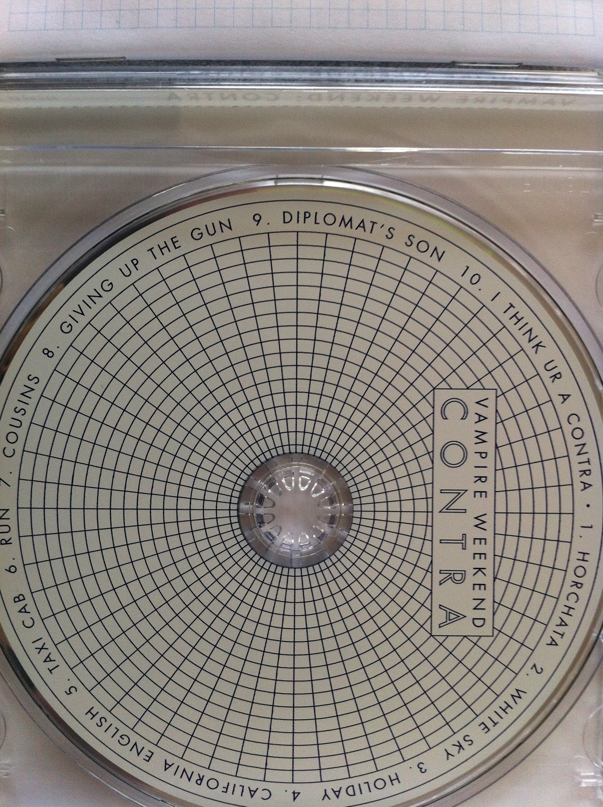
A lot of albums also feature a tracklist on their CD, like the disc for the album 'Contra' by Vampire Weekend. The artwork for this album is very geometrical. All of the lines are straight and it is all very precise. The colours that feature on the disc of the album are very mundane and normal which contrasts completely with the sound of the band which is original and upbeat.
 On Friday, we showed our video to our media class in order to gain some feedback which would evidently help us to improve our Final Cut even further. Showing it to our media class meant that we got the perspective of a media student so they would be able to notice more mistakes such as errors in continuity editing, as well as this, we are going to show the video to non-media students and see how the feedback differs
  A lot of the feedback that we got generally said that we need to focus on our continuity editing, and make some of the shots a bit shorter because there wasn't a huge variety of angles and camera shots, we plan to change the editing and put some more shots in to make it look more authentic as well as making sure that is editing is continuous and the transition between shots is smooth.